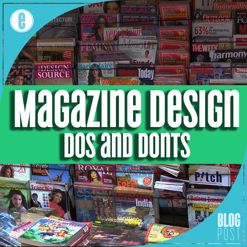
From the stylish pages of fashion magazines like Vogue to the info-packed spreads found in Scientific American, there are a few unifying elements that make industry-leading magazine designs stand out from the rest of what’s found on the shelves. Magazine editing and publishing students spend scores of hours in dedicated magazine design courses – but truth be told, the lion’s share of great design advice boils down to a few key principles we are going to present an overview of for you today.
Keep text clean
The majority of what readers to take away from your magazine is going to appear in the form of text, so use clean typefaces, provide adequate spacing, and prioritize legibility above all else. That doesn’t mean you can’t have any fun with your layouts; rather, it means you need to focus on using typographic elements to augment the story the text tells instead of distracting readers from your message. Top tips for legible text include:
- Don’t use more than three fonts on a given spread (headers/footers/credits excluded);
- Don’t use body text below 10pt; and
- Don’t reverse text out of pale color blocks or photos with variegated backgrounds
Keep readers moving
Another key to conveying clear messages in magazine design is providing readers with visual queues that effectively “pull” them along through the individual articles and the publication as a whole. There are a number of simple ways to do this, surprisingly few of them involve putting bold red arrows pointing right on pages. Generally, images, where motion is captured, should be placed so that the motion is moving toward the ‘next’ page in the publication. Italic text provides another subtle queue to readers that they should ‘move forward’ through the article. Another simple ‘motion’ queue can be provided by nesting the headline into the body copy so that readers are guided toward the start of the piece. Directional pitfalls are usually easy to avoid, try to:
- Avoid creating visual stops in the flow of text – a full stop at the end of the last column on a page implies the article is over, so give readers a queue to keep reading;
- Don’t let images create ‘walls’ that stall readers’ progress; and,
- Don’t cram so much text on a page that it becomes difficult to navigate, instead break information into digestible chunks with subheadings, bullet lists, and graphics.
Foster engagement
Creating engagement is largely an editorial task – but without visual interest, readers often lose interest in a page and turn away. Good magazine design keeps readers interested by providing the subtle queues discussed above, as well as:
- Highlighting key facts;
- Enhancing navigation; and,
- Fostering interactivity.
Careful with color
In general, color should be used to accent and provide interest in a good magazine design –if not used wisely, color can create both visual distractions and legibility problems for readers. Just because there’re 64 crayons in the box, that doesn’t mean you need to use them all, right? Try to bear the following in mind when applying color to your magazine design work:
- A 10% tint block behind pull quotes or other decorative text elements is plenty.
- If you’re reversing text out of a color block be sure the type is large enough to be knocked out (generally over 12pt) and that the color is dark enough to provide adequate contrast (generally over a 50% tint)
If you’re looking for more in-depth information on how to maximize your message through effective magazine design, you’re in luck – this piece marks the start of a series we’ll be running to focus on good design principles for magazine designers. Our series will include pieces that focus on typography, page elements, color usage, and even production tips to ensure your pages fly off the press with all the flair you intended.
If you’re looking for more information to assist your business during this time, head over to our Marketing Resources menu to gain access to our Lead Generation Calculator, Website Analyzer, and to Download our Free 2020 Competitor Analysis Guide!
-FINAL(01-00)-White&Blue-01.svg)


