In one form or another over the centuries, we’ve used visual symbols to claim ownership, to signal our affiliation or to brand products with distinctiveness – being a Texas company, ranch brands come to mind. One look at today’s communication landscape, however, and it’s apparent that visual identity and brand needs have evolved.
 Due to the commercialization and mass production of art, design has lost a lot of impact and respect in the eyes of the consumer. What was originally a highly valued means of differentiating one company or product from another can now be crowd-sourced online or created in over simplified design programs. All of which makes a strategically sound, well-executed visual identity much more important as it will define and distinguish your business from the competition.
Think first
Typically, jumping straight to a design solution creates an identity that satisfies the impulses of the designer but often overlooks the goals of the company. Relevant, impactful identities are built on the underlying principles of the brand.
Ask questions before creating the brand
Every identity needs to be designed with a framework of relationships in mind – considerations that involve space, color, potential applications, media and materials. Grounded in an understanding of the intent behind the identity, the nature and scope of the program can take shape. At this point several clarifying questions about the visual identity should be asked.
- Who is the brand audience (not the commissioning party)
- Where and in what forms will it appear – correspondence, presentations, retail, signage, broadcast, print advertising, packaging, promotional products?
- Does it need to translate across cultures and languages?
- Are there legal or regulatory considerations that need to be reflected in the design?
- Is there a legacy identity that needs to be incorporated or ruled out?
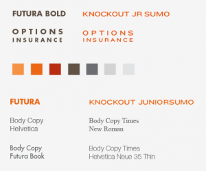
Speaking in type – choosing a font
 Type not only constructs words, it conveys it’s own meaning. The choice of typeface speaks volumes about the impression you’re trying to create, so it should never be an arbitrary selection. The history, shape, legibility and relationships of letters combine to create the look, feel and personality of an organization or identity.
Color with purpose
Color is the simplest way for audiences to distinguish one identity from another. Even at a glance, color can evoke an immediate emotional response and is usually the first cue for a customer to determine a connection with the brand or reject it. A system of color is an important asset in communicating identity.
Your identity is more than just a letterhead or a logo. It’s the visual expression of your brand, the most valuable and enduring competitive asset that a company can posses. The quality of your communications will either add to your brand value or detract from it.
Share some of your thoughts about what defines or creates a successful brand.
If you’re interested in learning more about branding, here are a few relevant posts we’ve written.
What is the difference between a Logo and a Brand?
-FINAL(01-00)-White&Blue-01.svg)


