It may be tempting to think that effective billboard design is nine parts “find an attractive person to plaster on it” and one part “everything else,” but there really is much more thought that goes into the process. The reality is that effective billboard design requires creativity, a concise, targeted message, consideration of issues like spacing and font, excellent photography, a story element, a specifically targeted audience, and, yes, occasionally an attractive or interesting person to place next to the message. A talented creative design team will be able to integrate all of these elements into a message that promotes your business to consumers and leaves a lasting impression in the few seconds people often have to look at a billboard as they pass. Ahead, we’ll go into a bit more depth about some of the elements involved in the billboard design thought process.
Simple but Interesting
The two words used above may seem contradictory, but in reality simplicity and attention-grabbing do not have to be mutually exclusive. The most effective billboards tend to deliver a clear, easily understandable message, without excessive clutter. When designing each element of a billboard, the creative designer must remember that a passing driver or passenger will only have five to ten seconds to look at the billboard. So, there needs to be something to attract their attention, comprising the interesting element, followed by a message they can understand quickly – the simplicity-based part.
Find a Target Audience, and Remember a Key Objective
These points go together because they are all about focused marketing, which is a key to the success of any billboard advertisement. The creative designer and the purchaser of the ad must first identify who the billboard will be designed to attract, so they can focus on appealing effectively to that group of people. Once the target audience for a billboard is determined, the designer, in concert with the person requesting the ad, need to decide what information needs to be conveyed to that audience, and how to do so most effectively. Billboards with extensive information about a business, product, service, or organization tend to be difficult to comprehend in the short window of time one views the billboard. Instead, the most important information for the ad must be boiled down to its true essence.
Figure Out the Fonts
Billboard design is typically not the arena in which to try out the latest fancy font. Though it may be tempting as a way to be different and attract attention, ornate fonts tend to be more difficult to read. Instead, the creative designer will tend to choose something bold, large and simple.
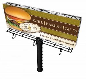
Image and Color Choice
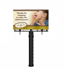
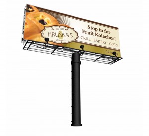
Generally, the most effective color choices for billboard design are bold and contrasting. The billboard designer wants to find colors that catch attention, while still allowing the information on the billboard to be easy to read. For images, clarity is key. It’s always important to remember just how large an image on a billboard will be, and plan accordingly. An interesting, high-quality photo is often the centerpiece of effective billboard design. It also helps to make the company’s logo stand out in a vivid, eye-catching way, giving the passing driver an image to retain even if they don’t digest all of the information in the ad.
These are some of the most common concerns of creative designers when working on billboard design. As you can see, effective billboard design is quite an involved process. The best creative designers will take all of these factors, and more, into consideration when crafting the perfect billboard design for your business.
-FINAL(01-00)-White&Blue-01.svg)
