If your digital marketing is a solar system, then your website is the sun. It’s the object around which all other channels revolve and a life-giving source for your business. In one of our last blogs, we talked about the importance of Conversion Rate Optimization, and today we’re going to talk a bit more in-depth about the top converting content pages your website should have to help increase your conversions and extend the reach and authority of your business.
Why You Need to Care About Pages That Convert
This will be a short section because the short answer to this is: Duh, because you don’t want to go out of business.
The slightly longer answer is that your leads, whether you’re B2B or B2C, are going to visit your website to learn more about your business, your products, and your services. They want to make sure you are legitimate, knowledgeable, and trustworthy, and, if you are an e-commerce business, they want to be able to buy your product.
All of these reasons come down to one thing: Your website is the way your leads interact with your business. If it’s easy to interact, you’ll see more conversions, if it’s harder to interact, you may not see any conversions.
5 Top Converting Content Pages
Now that we have the fundamentals, let’s take a closer look at the top converting content pages on your site, why they matter, and how you can make them better/more profitable.
1. Homepage
In the digital world, people DO judge a book by its cover. Think of your homepage as your cover–if it’s too busy, boring, or lacking information, people are going to put your business back on the proverbial shelf.
“But, Michelle.” you exclaim aloud in your executive office, “ I don’t get a ton of conversion from my homepage, don’t be a goofus.” First of all, thank you for using the word goofus, I’m not even mad. Secondly, that’s a wonderful point I want to address right now:
While your homepage does not get the majority of your conversions, your homepage will LEAD to a lot of your conversions. The homepage is where people get a first or second look at your brand (depending on how they’re landing on the site) and it’s often the highest-ranking landing page on your site.
You have 0.05 seconds (50 milliseconds) to make an impression on your visitors.
That’s how long it takes for a user to decide whether or not they want to engage with your brand based on design, layout, and information. If your homepage is not set up to guide your target audience through your sales process, you will not convert them. They will not visit other pages on the site, and they will not do business and encourage their peers not to do business with you.
Yes, your homepage, branding, and user experience are that important when it comes to converting your leads and ensuring your business’ longevity.
How to Make it Better
Your homepage is like a mini-funnel for your visitors, as they scroll down they’ll learn more and more about what you do and what you offer.
Top of the page:
- Think of your header as the top of the funnel. Make sure your header image or video is cleanly designed, fast-loading, and pleasing to the eye. Make sure your calls to action are more neutral, less aggressive, no one wants a giant BUY NOW button glaring at them when they land on a page.
- Chatbots or pop up CTAs are a bonus here.
- Chatbots: More and more clients are using chatbots to help answer FAQs or get some more details. Using a chatbot plug-in or the chatbot from your automation software (like HubSpot or SharpSpring) gives your leads a chance to speak to your business without using bandwidth to do so. Pre-set questions and answers are a good tool to make sure your customer service is 100% on, even if you’re closed or away.
- Pop-up CTAS: These are not pop-up ads. Automation tools and plug-ins can help set a timer for a pop-up CTA to appear–we know from experience that if you choose the write content or CTA to feature, you’ll increase your homepage conversions by…a lot. Basically, the CTA can be triggered in a few ways but for the sake of time, I’ll use this example: You have a new product or an ebook you really want to promote. You create your pop-up CTA to trigger after someone has been on the homepage for 5 seconds, the pop-up will appear on the right-hand sight with a set message and call-to-action, providing a new conversion channel on the page. I always recommend an offer like “Get this free ebook” or “ Get 10% off your first purchase!” Always make sure you’re giving something to your leads before you ask for something in return.
Middle of the page:
- Use trust symbols and signals like the logos of business or vendors your work with and testimonials from clients/customers to show your leads that other people have thrived because of you and they can too!
- Remember that peer reviews are 98% more effective than your native sales content, so your homepage should feature snippets, videos, or images that contain testimonials from real clients.
Bottom of page:
- While most users won’t make it to the bottom, you should always include content there like best selling items, blog content previews, or a newsletter form fill. Keep them engaged, and make it easy for them to contact you.
- Footers should also include the pages of the site, social media widgets, and contact information as some users scroll to the bottom of the page to get to more granular details like phone numbers, addresses, and other, more in-depth pages that may not be featured in the main navigation.
Overall, your goal should be to convince new visitors to stay on your website. Make sure your home page has CTA’s that are simple, relevant and appeal to your user’s pain points. Have your contact information easily available as well as an opt-in form so that they can convert without having to leave your homepage if they’re just doing a quick, fact-finding mission.
2. Blog
Number two on the list of top converting content pages your website should have is a blog. If you have a blog, you’re already driving traffic to it so be sure you’re using that traffic as another channel to help capture and convert leads. To keep people on your blog be sure to do the following with your content:
- Write for your audience. Make sure the content you create is helpful and relevant. If you’re just writing 600 word-long sales pitches, your wasting bandwidth, money, and your users’ time. Bad blog content can increase your bounce rate and decrease your website’s quality score.
- Quality over quantity. We used to write two blogs a week and now we only write one. Why? Because we found that our longer-form content performed better because it had more details and insights and less fluff. Your native content is here to help your leads and clients, so make sure what you’re writing solves a problem for them. Your blog shouldn’t be an endless parade of cheeky listicles or sales pitches.
- Be visual. Not all content is words on a page. Video, GIFs, infographics, images, all of these count as content, as well. Make sure your blog content contains visually appealing elements because it’s that link preview that will stand out in a social feed well before the headline does.
- Create conversion opportunities. Make sure it’s easy to subscribe to your blog by providing a simple subscription form fill. You can also put relevant CTAs for products and services in your blog content to help educate and capture leads.
Here is a quick conversion example:
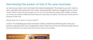
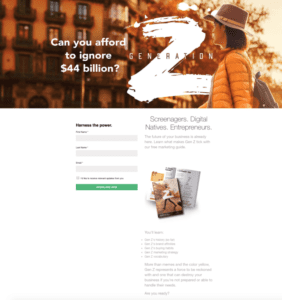
Last January, we wrote a couple of blogs about marketing to Gen Z to promote our Gen Z eBook. These blogs were short and informative, giving users some stats and a brief overview of what they could expect from the ebook. The CTA at the bottom of the page directed traffic to the Gen Zbook landing page.

We were able to capture 30% of our leads for this campaign through our blog CTAs alone!
If you’re creating content that your users want to read they’ll come back again and again and will share with their peers and friends, which in turn increases traffic to your site and gives you more chances to convert.
3. Landing Pages
A landing page is just what it sounds like: a page on which people “land” when they visit your site. Some landing pages are created specifically for conversions, which is something you’ll see if you click an ad for a download or a product. Some landing pages are just regular pages on your site that drive a lot of traffic (FAQs, Homepages, Contact Us pages). In this instance, we’re talking about the former
Landing pages are designed to generate leads for your business, making them the most important of all your top converting content pages.
- Your landing pages could offer:
- Online course enrollment
- Event registration
- Ebooks
- Newsletter subscription
- Free trial of a product
Make sure that all of your CTAs lead to landing pages that focus on a specific stream of traffic.
Using our example from above, if the CTA on the Gen Z blog post linked to our Social Media Cheat Sheet (another amazing resource you should check out), visitors would be less likely to click through because it isn’t relevant to what brought them to that page.

If you want to increase the conversion rate, don’t ask your visitors for too much information. Keep the form simple and straightforward.
4. FAQ Page
We’ve said it before and we’ll say it again: people tend to read 5-7 pieces of content before reaching out. New visitors want to get answers to simple questions without having to actually speak to someone.
An FAQ page makes it easy for them to find the answers they need as well as educate themselves about your business. This can help to keep visitors on your site, thereby improving your chances of converting them. It’s also a great page for long-form, native content which helps increase your organic SEO rankings which lets more people see your site which…you guessed it, can lead to more conversions.
5. Contact Us
Is this surprising? I hope not. Your Contact Us page is where leads (and yes, yes, vendors) can skip the line and contact you directly. Having a simple but concise Contact Us form can help you organize why people are reaching out, what they need, and who they are. We have a drop down menus on our Contact Us form fill to help leads self-identify:

Pair that with a top-notch automation and workflow campaign and your conversions really start to increase.
Please note that some people will choose to intentionally obfuscate their needs even on the most detailed form. We often have vendors who say that they want a quote instead of being honest and those contacts go straight into the trash. So, you’ll still have to deal with that, until salespeople don’t need to meet SQL goals, there’s not much to be done about it.
Top Converting Content Pages TL;DR
If your website wants to convert visitors to leads, it needs to have these high converting pages. Simply having these pages isn’t enough. Every website has a homepage — that doesn’t mean it will successfully convert visitors. If you want your website pages to convert visitors into leads, you need each page to be properly optimized with relevant content and CTAs that appeal to the visitor’s pain points.
-FINAL(01-00)-White&Blue-01.svg)


