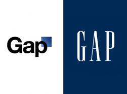
Recently, the popular clothing manufacturer, The Gap decided to rebrand itself by changing the company logo that has been recognizable for 20+ years. The new logo which was recently unveiled to the world can be seen below alongside the original logo which I’m sure you’ve already come to know and love.

The blogosphere has been flooded with people voicing their disdain for the new logo design, which many have called nothing more than a novice’s poor attempt at a logo design in WordArt. The new logo was an experiment that yielded a bevy of comments, both good and bad amongst all social media outlets online. And from the looks of it, this is exactly what The Gap was hoping to accomplish. Some have theorized that The Gap created a knowingly mediocre logo design in the hopes that it would incite a viral frenzy of activity in social media circles right before the holiday shopping season to help the retailer attain a “top-of-mind” awareness with potential shoppers. Good or bad, people were talking about The Gap and it appears that is exactly what they wanted. To be clear, there’s nothing wrong with this viral marketing tactic, however, it didn’t stop there. They took to Facebook to influence their fans and customers to submit their own logo designs for the new logo, (as can be seen by their own post below):

Now this may not sound like a big deal at first, but this is known as crowd sourcing and it is highly frowned upon by the design community for several reasons.
1) The client does not get the full benefit of the designer’s expertise in this type of speculative working arrangement, (The designer simply designs something they think looks cool and it may not even be applicable to the goals and differentiation of the company at all).
2) It ultimately becomes a contest where hundreds if not thousands of entries are submitted and all but the selected designer get nothing for their time and effort, (So far there have been over 3000 logos submitted!).
3) It encourages designers to plagiarize other credible logo marks to save time and effort that can result in disastrous legal consequences for the client, (Quark Software is a perfect example of this outcome).
4) It devalues the years of knowledge and experience that are gained in creating reputable brands for clients and boils it down to a simple art contest.
While crowd sourcing may initially appear attractive to the client company, it eventually offers more of a disadvantage to the client. It encourages novice and hobbyist involvement in creating a logo mark for something they know little about.
A credible logo mark is much more than a little icon on your business card. When done right, a logo mark can help indicate who you are, what you do and why you’re better than the rest. It serves as your 24 hour a day, 7 day a week sales rep. It creates a perception of value and understanding for your products and services. It conveys confidence and credibility without the need for any further explanation. It’s what connects the audience to the brand.
But none of this is accomplished successfully without first asking lots of questions and having long conversations to determine the client’s situation analysis, primary target market, point of differentiation and business objectives moving forward. All of these factor in to help a qualified design professional create a logo mark that embodies all of the key brand attributes of that company.
This is less about an exercise in art techniques, and more of an exploration of marketing communication through visuals. And in my opinion, something as critical as The Gap’s brand imaging should not be left up to the masses of hopeful design enthusiasts with dreams of free khakis on their mind.
What are your thoughts about the Gap logo project, or the idea of crowd sourcing? Share your thoughts if you’ve had good or bad experiences with this.
-FINAL(01-00)-White&Blue-01.svg)


