Choosing what colors you’re going to use for your logo and general branding is incredibly important. We live in a world of color and subconsciously lean towards some colors more than others. Choosing a logo is hard enough but choosing the main color of your logo means consumers will automatically associate that with your brand from here on out.
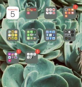
I organize my whole phone by color. Perhaps that means for me I have a little more awareness of app colors when I’m opening them. What I can tell you is that blue, red, and green are the biggest folders full of apps on my phone.
With branding, colors are not just an aesthetic choice, they are a psychological one as well. Color has certain psychological effects and can influence how you feel about a brand. It’s worth noting that there are a few colors that have saturated (pun intended) the market.
The Three Most Common Brand Colors
The following are the three most commonly used colors in branding and why they are so popular:
1. Blue (is the warmest color)
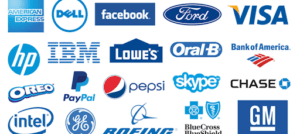
Association to blue: trust, freedom, strength, reliability, and confidence
Besides the overwhelming amount of songs and movies with the word blue in the title, blue is without a doubt the most common color used by brands. There are several reasons for this. Blue is associated with trust, freedom, strength, reliability, and confidence. It’s why companies like the App Store, Facebook, Shazam, Safari, Outlook, Venmo, and even Envision all use blue as our primary color. Companies like financial services and social media platforms use blue because it’s familiar and reliable.
But this isn’t the only reason blue is used.
Blue has a naturally calming effect on people. Studies have even shown the color blue to slightly reduce the heart rate upon observation.

Not to mention, blue is associated with things that people see every day, such as the sky and the sea. There is even a correlation of trust with people who have blue eyes due to the fact that it is easier to see how their pupils react.
The problem with using blue is that the majority of brands use blue and white so it can be difficult to create a logo that actually stands out. There are only so many variations when it comes to blue text on a white background or vice versa. Not to mention that without highly skilled professional design work, a logo can easily be lost in the color blue – to the point where the consumer sees blue and nothing else.
2. Red (means stop)
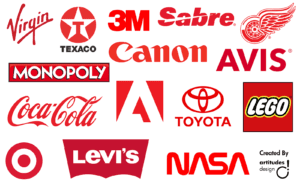
Associations to red: boldness, hunger, passion, excitement, danger
Red is a color used within every industry due to the bold presence it demands. As a kid, we learn, “red means stop, and green means go.” That lesson isn’t easily forgotten and is one of the hidden tactics used on social media to encourage someone to not just scroll past your post.
Not only do we look at the way food is prepared but the packaging it comes in. It’s no shock to see food and beverage brands like Coca Cola have long utilized red throughout the years to keep our attention. Target, Canon, Nasa, and Adobe are all brands that stand for bold statements and big ideas that their colors represent. In fact, restaurants often combine the use of red with yellow, this is called the ketchup and mustard theory.


Look familiar?
Red can represent a number of things, including passion and excitement.
Psychologically, it’s also been shown to trigger stimulation and appetite. Out of all the primary colors, red attracts the most attention and from a young age, we are taught that red means stop. It’s no surprise that fast food restaurants try to use red in some way to attract attention from the road and stimulate hunger, such as Wendy’s, McDonald’s, Jack in the Box, In n Out, Arby’s, KFC, and Burger King. While brands like Adobe, Nasa, Lego, Red Bull, and ESPN use red to generate excitement, movement, and action.
Red is tricky because of how many brands and specific industries use the color–but also because the color can have negative connotations, such as aggression, blood, and danger. There aren’t many variations in the primary shade of red used by most larger business brands. The attention-grabbing nature of the bright red is quick to attract attention and add meaning to a brand’s identity.
3. Green (means go!)
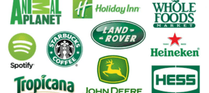
Green is mostly associated with the environment and health. It gives off a nurturing and compassionate feeling.
It’s also pretty common to see a health food brand, like Co-op or Whole Foods, use the color green. In fact, a green icon is what we typically see in grocery stores and on menus to indicate a healthier or vegetarian/vegan option. Green is iconically associated with nature which also enforces the feeling of growth.

The US came up with a campaign to help save energy and electricity that is literally called, “Going Green.” The Green Movement began in the 70s but has picked up momentum over the past few decades. We see more green used in logos than ever before with logos from apps like Ca$h, Lime, Google Maps, Groupon, Hulu, and WhatsApp, all utilizing green in their branding. Even messages to Android phones show up in a green bubble on an iPhone.
Companies like Animal Planet, Spotify, Subway, and Starbucks all use green effectively. Some companies even use green in an attempt to appear concerned about the environment, such as BP and Land Rover, even though they may not have the environment’s best interest at heart.
Tips for Choosing Effective Brand Colors
You want your brand to stand out, which is why you might want to avoid the most commonly used branding colors. Rebranding is a great way to elevate and enhance your audience’s perception of the value of your business and if affects how customers interact with you and what kind of customers you attract.
Keeping that in mind, the following are a few tips for using color:
Understand your audience

What is the message you’re trying to convey? Luxury brands like Prada, Gucci, and Versace have long embraced the simplicity of black and white in their logos. Tech companies like Apple followed suit understanding the heightened sense of value and intrigue that follows such a simple color palette.

Additionally, it gives these brands the freedom to play with colors and textures outside of their logo in ways they might otherwise not. Understanding your target audience and the message your brand wants to communicate to them might help you dig into color theory and choose something that’ll resonate with them.
Consider your competition
If you’re selling a health food product, then look at all the other health food products on the market. If those brands are all using green, then maybe you should choose a different color to stand out from the competition.
When you’re grocery shopping, how many brands can you remember whose logos and colors looked similar to their neighbors? Too many. Let’s say you’re a company involved in selling health food products. You should take the opportunity to look at what your competitors are doing and understand if choosing a similar color palette to them will make it harder for you to differentiate yourself or complicate things for your consumer.

Who remembers the olive oil hairspray used as cooking spray epidemic?
Let’s exit our imaginations and come to a very real example. Look at UPS, FedEx, and DHL.


These three brands all deliver mail, but their logos couldn’t be more different. This allows them to develop a distinctly different brand personality for their audience and creates some psychological distance from their competitors.
We can look at companies like American Airlines, United Airlines, and Southwest Airlines and see the same thing. The list goes on. When choosing your colors you have to assess your competition.
Know what colors mean
We dipped our toes into the complex world of color theory a bit earlier. There are a few additional things to think about when developing your brand identity. We’ll talk more about understanding your audience and your competition later but first I want to bring your attention to two things often forgotten about when developing a brand identity: color meaning and distribution.
We talked a bit about the three most common colors used in logos but there is a lot more ground to cover. After all, there are entire textbooks written on understanding colors and their meanings in design, architecture, paint, and more. If you want to go down the color rabbit hole we’ve got you, look here, here, and here.
Just like knowing what the peace sign means in other countries, understanding the meaning of certain colors in other countries is valuable if you plan on reaching a global audience. Web Designer Depot does a good job at pointing out just how the meaning of the color red changes depending on the country you’re in.
America – Passion and excitement
Asia – Happiness and celebration

Latin America – Religion

Middle East – Danger and Caution

It’s always important to keep these color meanings in mind when you’re considering distributing to an international audience.
Be creative with color and space
You don’t always have to stick with the textbook definition of what’s appropriate or common in your industry. Lemonade, the home renters insurance app, stood completely apart from the audience with its pink logo. Companies like Google taught us you can even use the rainbow. Think, experiment, and be unique. Because the market doesn’t need another sky blue logo.
Contemplate the value of utilizing negative space in your logos too. Companies like USA Network, TNT, and TBS (see a pattern here) use negative space that allows them to conveniently overlay their logo on other assets and play with color in ways they might not otherwise. Have fun with it.



Color, type, negative space, sizing, and many more factors play into how your logo and brand is perceived by consumers. We don’t discourage the use of red, blue, or green because they’re common. We just ask our clients to think outside of the box and understand the value that can come from looking different than the rest of your competitors.
tl;dr
The Too Long; Didn’t Read of Brand Colors
Color theory can be confusing, and when it comes to logo design and branding the challenge only grows. Red, blue, and green are the three most commonly used primary colors in logo design. Many of the world’s biggest brands use one of those three colors. Each has a number of associated emotional and psychological responses they elicit. A few tips we have when developing your logo or re-branding — you have to have an understanding of your audience, think about your competition, know what colors mean, and be a little creative or adventurous.
Still unsure where to begin? We have a team of designers that excel with logo design and branding. Check out the variety of logos we’ve designed and reach out to us if you need help!
-FINAL(01-00)-White&Blue-01.svg)

