::WARNING:: THIS POST MAY MAKE YOU WANT TO GRAB A CERVEZA
Guest Post by Viviana Baluja
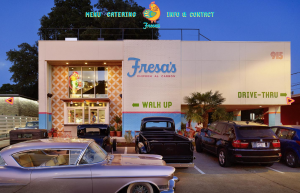
If you’ve been down Lamar, chances are you’ve passed by the two-story bright blue and pink colored building that sells some of the most authentic tasting Mexican food in Austin. With more than 35% Latinos living here, we have access to so many Mexican food places but none compare to the quality of the food at Fresa’s, the atmosphere of the restaurant and most importantly—the branding.
As a foodie and new Austinite hailing from Dallas, I’ve dined at my fair share of restaurants from all types of genres. Some were impressive (most weren’t) but never has a restaurant stood out to me as much as Fresa’s Chicken Al Carbon.
Just to mention, if you’re looking for a sit-down meal, don’t come here. It’s for pick-up or drive-thru only. They have complete chicken meals for 2-4 people, tortas (sandwiches), salads, traditional bebidas (drinks) and some of the tastiest sides. But if you’re like me, you’ll park somewhere down the street and dig in animal style.
CREATIVE BRANDING

I originally stumbled upon them online after looking at their sister company, Elizabeth Street Café. Once you look at their site, you’ll notice they have a similar feel and that’s because the web design is done by this guy, Paul Fucik, Owner & Designer at Arts and Recreation. Design wise, it’s trendy, clean, colorful and simple which is perfect because you can use those same words to describe Austin.
When you go to Fresa’s website you’ll see what I mentioned to you in the beginning—their building. Once you look at the shot (screen shot above) you’ll notice three vintage cars parked in front and one in the drive-thru. The three simple tabs at the top of the page center around their mascot, the chicken, and there’s an arrow on each side that give you a look into the Fresa’s brand. It’s so simple to navigate and the bright colors are so inviting. After having looked at their site, I made plans to go that same day and have brought people there twice since.
PRODUCT PACKAGING
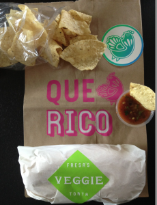
 And now onto the really fun part: product packaging. If you think about most take-out places, they just stick your food in a plastic bag and tie a knot at the top. So I guess you called it—Fresa’s is different. As you can see in the picture, your food comes in a paper bag stamped with bright spanish words “Que Rico” (how delicious). The food comes with a sticker on it that labels your food from your friends and then there’s the famous chicken logo. It’s on the front of your bag and just in case you want it after you throw away your food, they throw a chicken sticker into the bag too! It’s so cute you’ll want to save it. Even the silverware comes with a sticker on the front that says “sabor” (flavor).
From the moment I looked at their site to the moment I drove up, drove off and tasted their food I’ve been hooked. I am completely sold on them as a whole and you will be too. The food is excellent and real Mexican food, the branding is on point and the packaging makes you want to handle it nicely and save it for later.
-FINAL(01-00)-White&Blue-01.svg)


