The History of the Envision Creative Group Logo
We’ve heard many clients express how engrained their current logo is in the minds of their customers, and how—after 10+ years of being in business—it would hurt them to ever change it. It’s a common misconception among companies and one we almost always disagree with (I’m sure there are exceptions to this, but we personally haven’t encountered them yet). Even mega-corporations change their logo from time to time and they don’t suffer the catastrophic fall out most clients fear. So, to prove our philosophy, we’re sharing with you the evolution of Envision Creative. Here you’ll see the logo designs we’ve used and abandoned over our 16+ year journey as one of Austin’s leading branding and marketing agencies.
Enjoy our walk down memory lane. And try not to laugh too hard, as times were different back then!
2001

Along with a new website, this logo was born and executed over three days of heavy caffeine usage and sleep deprivation. It showed the pre-Google world that Envision was here and ready to start helping local small businesses with their graphic design needs. The logo design was meant to be conservative in blue and gray, as well as convey a larger, more corporate feel than what we actually were.
2004
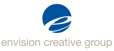
Only three years into our journey and we were already tired of the logo that seemed so cool when we started. Internet usage was undeniably increasing and we wanted a logo that had a more prominent, iconic element that could stand on its own… cue the big blue ball. Still conservative and corporate in its appearance, the logo felt more modern than our previous one.
2007
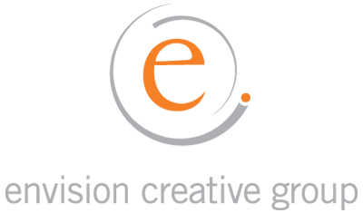
Now with a cool downtown office space, and with Google and social media still in their infancy, we felt the need for something more energetic and active. We opted for a new color palette, introducing a warmer, friendlier orange to the mix as well as the essence of motion. The new logo design jumped onto the ever-growing “orbital swoosh” bandwagon. We officially registered our name and logo mark as U.S. Trademarks… The swooshes quickly got boring.
2011
Post housing market recession, we found ourselves wanting to be less conservative, opting to show off our creative side a bit more. Steeped in branding experience and now offering in-house web development, we created a new logo with some of the most trendy (and heavily-used) fonts of that year. We landed on a logo with more playful colors and a distinctive iconic element that was to be used heavily on branded merchandise for the better part of the 6 years that would follow.
2016
![]()
or the icon version

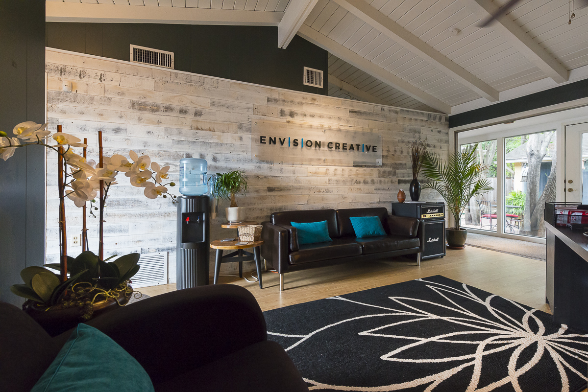
Now with a team over 14 times larger than when we started, we feel that we have matured as an agency, providing not only branding and web services, but also comprehensive marketing services. We’re no longer the tiny shop trying to get noticed for our design capability. With a healthy stable of recurring clients, it was time for our logo to convey a more sophisticated, understated look that exuded confidence and experience. We created a logo in a dark grey and medium blue with a timeless, all-caps font that could be used with or without its new E | C icon. We branded our building with large signage and invested in a lobby remodel, as well as new corporate collateral items that reinforce the experience clients have when they visit us. We anticipate using this logo for many years to come… but then again, you never know what design we’ll come up with next!
Recommendations Before You Decide to Rebrand
It’s important to note that each time we changed our logo it was because of a significant change in our business—who we were and how we were trying to be perceived at that time. A logo design change just for the sake of change can be a costly endeavor that lacks results. Before beginning any rebrand initiative, it’s important to fully understand who you are as a company, who your ideal target audience is, and how you want to be perceived by them. It also doesn’t hurt to have an experienced branding agency help you discover the answers to these questions, and then trust them to deliver the best possible graphical representation of your brand.
-FINAL(01-00)-White&Blue-01.svg)
